ED659 – Photography

For this assignment, I used my Samsung Galaxy 5S Active phone with the built-in camera app and also the Better Camera app. Although I have taken other photos that I feel are more beautiful (such as the berry photo on my About page or my Creative Commons post), I took new photographs, experimented with camera settings, and created a story with Legomen and various props. In cropping, I tried to be mindful of composition and the rule of thirds. Although I took over 40 photos,  many were not satisfactory because I was experimenting with various camera settings.

Photos in my Google Photo Album:

TIFF Photos for Printing

thumbnail

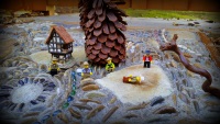
The serpent has attacked! Here is a thumbnail link to a TIFF file located on my Google Drive. I added Vivid saturation and the Vignette effect in Picasa and then opened it in Paint.net to save as a .TIFF file

I made the next thumbnail a bit larger:

link to TIFF file

f2.2, focal length 4.8mm,(35 mm equivalent:31mm) I cropped the photo for 16:10 widescreen photo frame and added text in paint.net. I thought our assignment said to add text to one photo, although I think I misunderstood. The composition is unremarkable, but I thought it necessary to include for my story.

Photos for Monitor Presentation

monitor photo

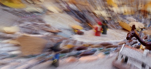
Does the crowd blame the big guy for the serpent attack??? Cropped for wide screen monitor 16:10 and added fill light.

20150924_141359_Monitor_standardscreen

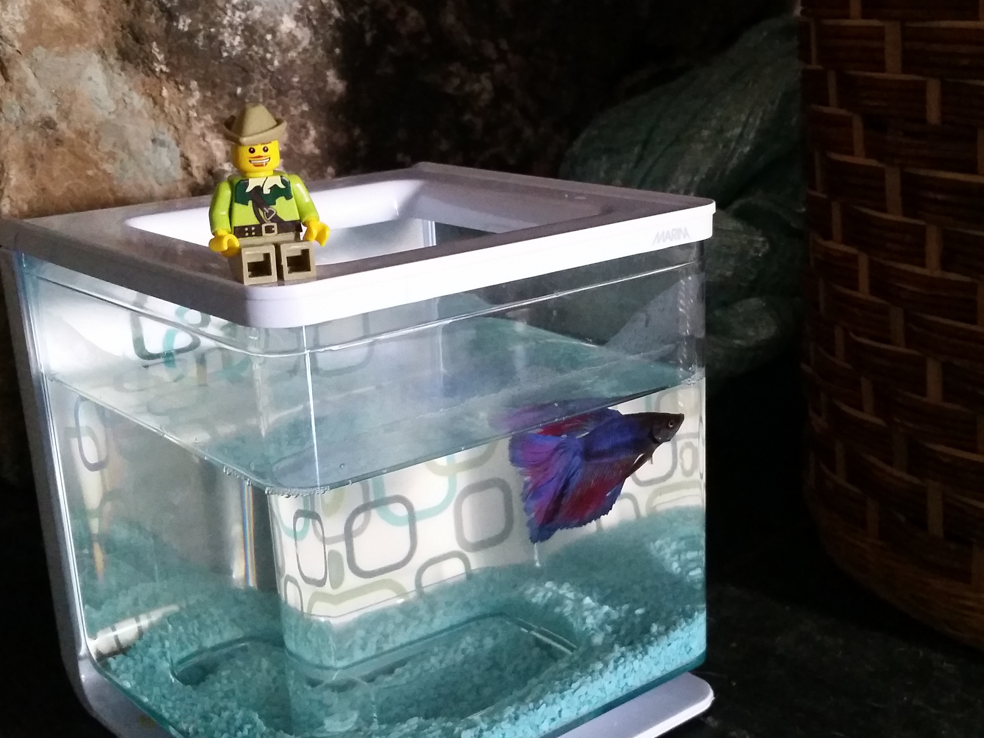
Perhaps this fish can help solve the mystery. Cropped for standard screen size. Because of the dark corner, I used a higher ISO setting of 640.

Photos for web use

web use 2

Danger! Experimented with changing ISO. Cropped, added focal point blur. Resized for web.

web use 1

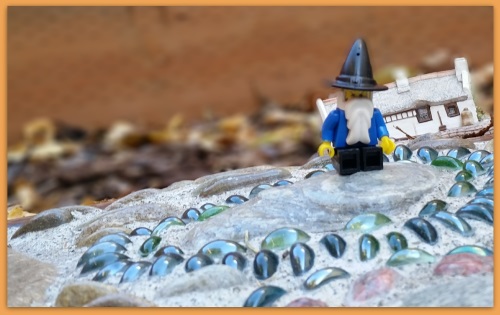
Alone. He could not save the others. Cropped, increased shadows, added border, resized for web.


ED659 – Web site

I had already created a site for ED 654, but added pages for my classes this semester. (Other site attributes: I’ve included the akismet and table of contents plus plugins.) I also added a plugin for social media and I’m not totally happy the way they are always bouncing around the bottom of the page (fixed by placing on About page only).

My WordPress theme is called Sparkling, which does allow a graphic to go in the header. Since I need a logo for ED 659, I attempted to create one. My graphics editor was Paint.net, which is made for Windows users and  free to download.

Here’s what I did for the logo that is currently in use: I used Windows clipping tool to capture a rectangular area of the charcoal color in the header. I created a new file in Paint.net using the size that my theme suggested, which was 300 x 76. I opened the charcoal screen capture block and used the color picker to snag the color and then dumped it into my background layer. I created a new layer and opened my photo with the berries and selected a berry using the lasso tool and pasted it into the layer. It was way too large and had to be resized. I created a new layer and changed the font to Euphorigenic and changed the color to white and the size to fit and typed my first name. I created another layer and typed in my last name, offsetting it a bit from my first name. I created yet another layer and typed in the NID letters onto the berry, then used the ellipsis tool to create a circle around it for the ‘O’ in ONID.

I saved the file as a .pdn which is the Paint.net default and preserves the layers for additional editing. Then I re-saved it in .png format for my website, which flattens the layers. I experimented with using other colors of text such as black (for the NID) or red. White seemed to stand out the best. However, because there is a berry within the O of ONID, the highlight on the berry may make it somewhat difficult to read.

I realize my logo is pretty crude. Perhaps my classmates may have some suggestions for me. Please comment.

Here are some other attempts:

logo 1

logo 3

log2

I just attempted to get rid of the glare. I alco changed the font for NID. Is this one below better than the current one?

logo4

or here’s with other colors:

logo5

Thanks for the feedback, Nick, and also from DonKeriann, Matt, and Lindsay via email. Instead of trying to circle a berry from my photograph and then remove the glare, I took your suggestion and used a gradient fill and changed the font to be consistent with the site navigation font. I tried (right or wrong) to make my first and last names start and end at the same point, hence the font size difference. I can now see a difference in my background colors. I tried again, using a transparent background, but the white lettering was not as sharp, so decided to leave it as is…

After repeated tries (I’m now up to logo13) I’ve finally stumbled on the right color-hex to match. The other difference is I tried saving it as a .jpg instead of a .png. Logo13 in header appears to match on my monitor and I hope it does elsewhere.

logo13

Now that the logo is done, I added a site icon so that there is a white J on a red square in the browser tab when you visit my site pages. I used Paint.net again to create a 512×512 graphic. I continue to add and tweak and am exploring some more plugins.